Neumorph's Proficient Toolkit for Seamless UI and App Development
My Role
UI/UX Designer
Tools
Figma, Illustrator, Unity
Year
2022
Overview
As the Head of Design at Doozy Entertainment, I partnered closely with the Dev Team to develop – a purpose-built design system exclusively designed for app development utilizing the Unity Engine.
Employing popular design tools like Figma, Adobe Illustrator and Unity, I created a comprehensive toolkit comprising a diverse range of app-ready components, including icons, prefabs, buttons, layouts, tabs, dropdowns, and other essential UI elements.
Neumorph offers app and game developers a reliable and consistent resource, enabling them to create polished user interfaces for their applications. Drawing on my expertise in UI Design and App Development, this meticulously crafted toolkit empowers creators to craft seamless and visually appealing experiences for their users.
Neumorph One Contains:
486 Prefab Elements
Grids
Layouts
Typography
Icon Library
Effects
Sounds
Multiple scripts to enhance functionality
Fully functional Prototype
Colors
Colors are essential for creating visual impact and distinguishing a brand. They convey individuality, attract attention, and establish visual hierarchy.
Our carefully curated color palette fosters harmony and simplicity, enabling a memorable and engaging user experience while reinforcing the brand’s identity.
Typography
Typography sets the groundwork for headings, body text, links, and buttons, providing a consistent and readable visual language throughout the interface.
Icons
Icons symbolize actions or tools in an interface. To create a unified icon family, we follow consistent artistic principles.
Components
Design components serve as the foundational elements used to construct modules and displays in our product. It is crucial to have a reference for every visible component on the screen, allowing for swift and efficient modifications whenever necessary.
Here are a few examples:
Buttons
A clickable object which prompts certain actions is referred to as a button. It conveys an instruction to the user and enables them to engage with web pages in various manners.
Button Variants
Button Shapes
Button Size
Button States
Expandable Button
This button triggers a range of options upon being clicked or tapped. It offers a streamlined interaction flow, preventing screen clutter, which is especially crucial for mobile interfaces with limited screen space.
Expendable Bottom, Left, Right, Top
Expendable Horizontal
Expendable Vertical
Toggles
A toggle switch, also referred to as “toggles,” is a user interface control that presents two mutually exclusive states, such as ON and OFF. Inspired by physical switches like light switches, toggle switches allow users to activate or deactivate objects within an interface.
Despite their longstanding presence in user interfaces, toggle switches are often misused by designers, leading to unfavorable outcomes.
Checkbox
Checkbox States
Radio
Radio States
Switch
Switch States
Tabs
Tab States
Input Fields
InputField is a versatile component that enables user interaction with input content and data. It serves as an effective tool for capturing both long and short form submissions.
With its flexibility, this component empowers users to input and submit various types of information within the interface.
Dropdown
A dropdown menu allows users to choose from a list of options.
Slider
A slider is a control mechanism that uses a horizontal knob or lever to regulate a variable, such as adjusting radio volume or controlling screen brightness.
Grid System
The grid system uses a series of containers, rows and columns to arrange and align content. For the prototype, we used 12 columns with a gutter of 14 (optimized for mobile).
Design Templates
A design template is a mix of looks and practicality. Thoughtfully designed for a user-friendly experience, it seamlessly merges modern aesthetics with practical features. This template ensures your content takes the spotlight, thanks to its intuitive interface and easy navigation
Fully Functional Prototype
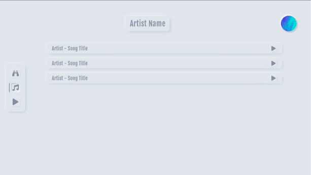
Prototype is a working model of a product that can be used to demonstrate and test the product’s functionality and user interface. In the case of this particular design, the prototype showcases the various features and interactions of the app, allowing users to see how it would look and feel in action. By providing a tangible representation of the design, the prototype helps to communicate the project’s vision and provides valuable feedback for further development.
As part of our design system, we provide a complete and functional demo prototype that can be easily integrated into your app, allowing you to explore its features directly.


