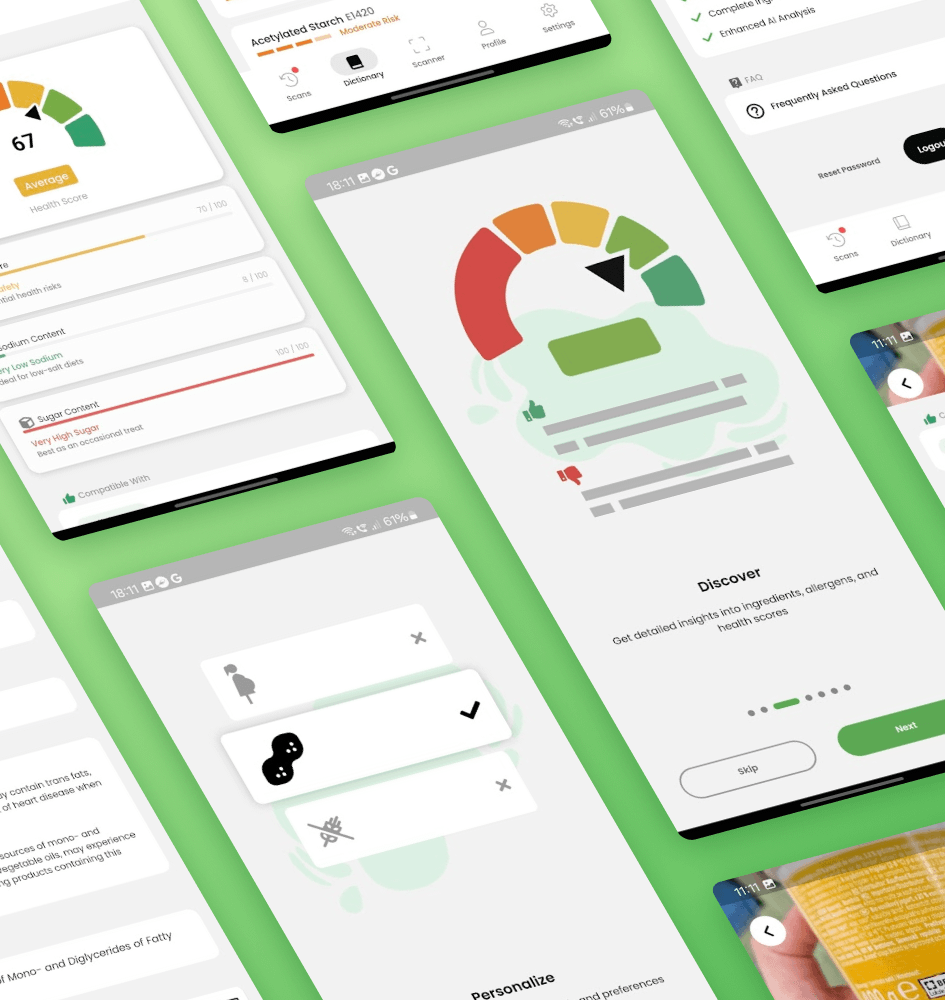
As the Lead UI/UX Designer for Eat IQ, I spearheaded the design process to create an innovative AI-powered food label scanner. Collaborating closely with the development team, I crafted an intuitive user experience that empowers users to make informed dietary choices effortlessly.
From wireframes to final mockups, I focused on user-centric design principles, ensuring seamless navigation and clarity in displaying nutritional insights. Additionally, I led the branding efforts, creating a visually compelling identity for Eat IQ across Google Play Store and Apple Store platforms.
UX Insights & Testing
UX Analysis: Conducted a competitive analysis, identifying Yuka, Open Food Facts, and Fig as main competitors. Analyzed user feedback noting issues such as slow application performance, intrusive advertisements, inaccurate or missing information, and poor user interface design.
User Story: As a health-conscious individual, I want to effortlessly analyze food labels for nutritional information, allergens, and ingredient quality, so I can make informed dietary choices.
User Interview: Conducted online surveys on our Discord Channel and reached out to acquaintances. Gathered feedback on user experiences, pain points, and suggestions for improvement. Insights gleaned from real users helped refine the app’s features and usability.
Usability Testing: Collaborated with a separate team unfamiliar with our product to conduct usability testing. Observed user interactions, collected feedback, and iteratively improved the app’s interface and functionality based on testing results. This process ensured a user-friendly experience for all users, regardless of familiarity with the product.
User Flow
A user flow is a visual representation of the steps that a user takes to complete a task on a website or app. It is a way of understanding how users interact with your product and identifying any areas that may be causing problems.
Typography
For this project, I chose a sans serif font named Noto Sans because it is a high-quality, open-source font that is available in over 1,000 languages. Noto Sans is a versatile font that can be used for a variety of purposes, from headlines to body copy. It is also easy to read on screens and in print.
Colors
Explore the color palette I designed for Eat IQ’s light and dark themes. Carefully selected for readability and visual appeal, these colors ensure a seamless user experience, enhancing accessibility across the app.
Branding
Logo
After numerous iterations, we settled on the Eat IQ logo, resembling a sleek, modern interpretation of an abstract avocado (or fruit). This design choice reflects both intelligence and nutrition, aligning perfectly with our app’s focus on healthy eating.
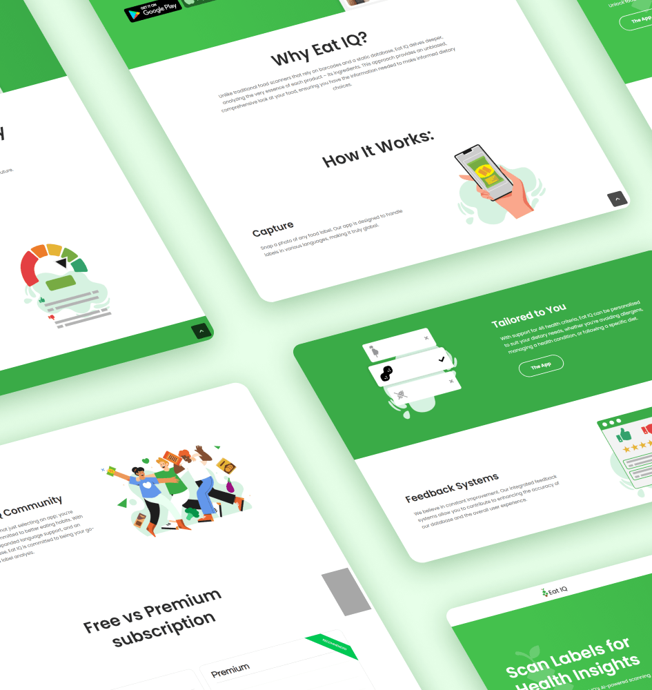
Website
I’ve created a sleek and simple website to complement the Eat IQ brand. With intuitive navigation and engaging visuals, the site mirrors the app’s user-friendly approach, providing visitors with a seamless experience.
The full case study of the website can be found here.
Stores screenshots
I’ve ensured that the branding materials for the Google Play Store and Apple Store resonate with Eat IQ’s identity. By maintaining consistent colors and typography, we’ve crafted a unified visual presence that reflects the essence of our app.