Unlock Seamless Unity UI Brilliance for Your Game Design with Casual Pro
My Role
UI/UX Designer
Tools
Figma, Illustrator, Unity
Year
2023
Overview
As the Head of Design at Doozy Entertainment, I created Casual Pro with the help of the dev team, a professionally design system developed specifically for game development using the Unity engine. I utilized popular design tools such as Figma, Adobe Illustrator and Unity to create a comprehensive toolkit that includes a variety of game-ready components such as icons, multiple prefabs, buttons, layouts, tabs, dropdowns, and other essential UI elements.
Casual Pro provides game developers with a reliable and consistent toolkit to create a polished user interface for their games, thanks to my expertise in UI Design and Game Development.
Casual Pro Contains:
133 Prefab Elements
Grids
Layouts
Typography
Icon Library
Effects
Sounds
Multiple scripts to enhance functionality
Fully functional Prototype
Grid System
The grid system uses a series of containers, rows and columns to arrange and align content. In this design system we used 12 columns with a gutter of 16 (optimized for mobile).
Colors
Colors generate visual impact and help to differentiate a brand. It communicates individuality, draws the attention, and denotes visual hierarchy.
Our color palette offers a feeling of harmony and simplicity.
Typography
Typography begins by laying the groundwork for components like as headings, body text, links, and buttons.
Icons
Icons are graphics or symbols that represent certain actions or tools in an interface. To establish unity for an icon family, we must adhere to the same artistic principles.
Flat Icons:
Colored Icons:
Avatars:
Components
Design components are the building elements that we employ to develop our product’s modules and displays. Every component visible on a screen should have a reference so that it may be quickly changed at all times.
Let me show a few:
Buttons
A clickable object which prompts certain actions is referred to as a button. It conveys an instruction to the user and enables them to engage with web pages in various manners.
Button Variants
Button Shapes
Button Size
Button States
Toggles
A toggle switch (sometimes known as “toggles”) is a user interface control with two mutually incompatible states, such as ON and OFF. This control’s design and operation are based on a physical switch that allows users to toggle objects ON or OFF (for example, a light switch).
Even though toggle switches have been used in user interfaces for some time, many designers continue to abuse them.
Checkbox
Checkbox States
Radio
Radio States
Switch
Switch States
Tabs
Tab States
Input Fields
The user can interact with input content and data through InputField. This component is suitable for both long and short form submissions.
Dropdown
A dropdown menu allows users to choose from a list of options.
Slider
A slider is a control device that employs a horizontally moving knob or lever to regulate a variable, such as radio volume or screen brightness.
Design Templates
A design template is a mix of looks and practicality. Thoughtfully designed for a user-friendly experience, it seamlessly merges modern aesthetics with practical features. This template ensures your content takes the spotlight, thanks to its intuitive interface and easy navigation
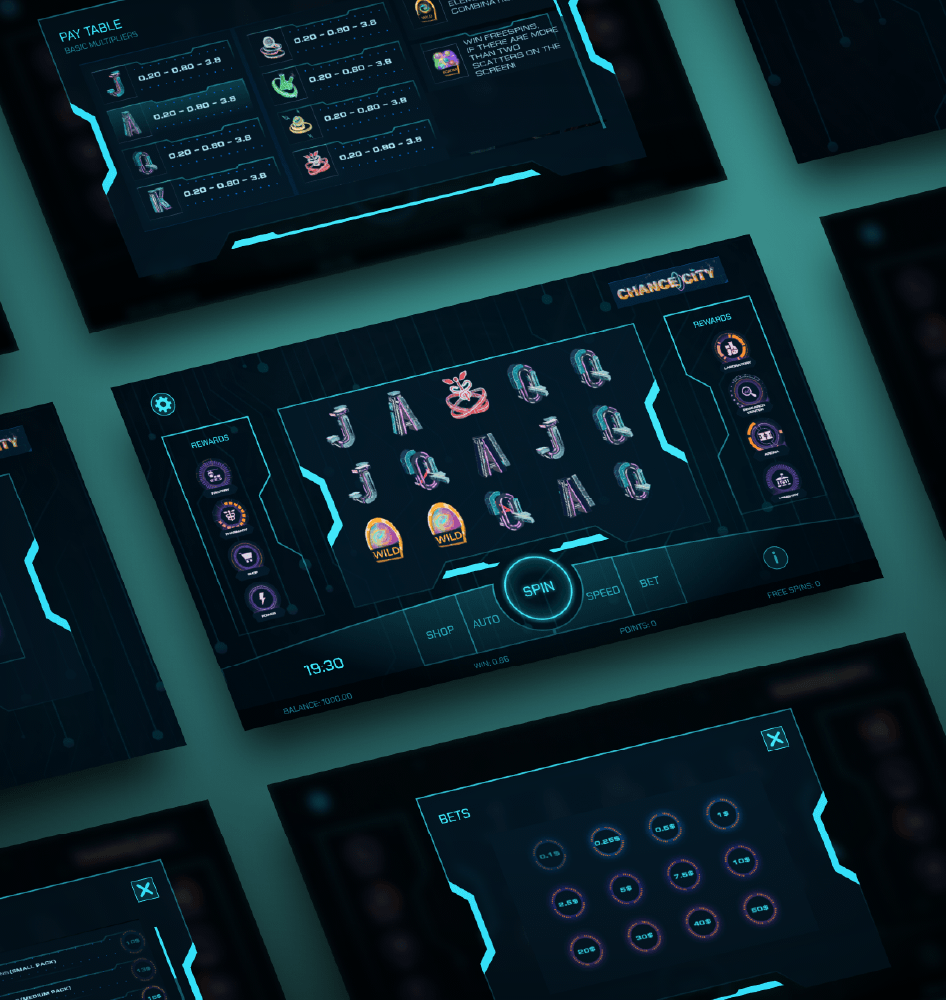
Fully Functional Prototype
Prototype is a working model of a product that can be used to demonstrate and test the product’s functionality and user interface. In the case of this particular design, the prototype showcases the various features and interactions of the app, allowing users to see how it would look and feel in action. By providing a tangible representation of the design, the prototype helps to communicate the project’s vision and provides valuable feedback for further development.
We also provide for this design system, a fully functional demo prototype, where the user can use directly into their game.


